
case study:
10 marker set collection
How it started

Group of sets
When Spectrum Noir approached me, they were looking into updating their current range of marker sets. They wanted to add appealing visuals to the packaging as well as create several marker sets that could be used on their own or mixed and matched.
Spectrum Noir intended to create an artist’s curated collection of marker sets that together formed one cohesive colour story.
After the in person discussion, we agreed on the scope of this project and set deadlines.
Goals set by the client:
A collection of small Illustrator sets. The goal is to encourage experimentation.
Created for both new and regular customers. Prompt regulars to extend their marker collections with new sets.
Curated by a professional artist. Within each set, colours blend well together and create new hues when mixed.
Each set is devoted to a different theme and comes with its own pack-front illustration to inspire.
Create one harmonious palette, so sets can be purchased separately or as a collection.
Instruction comes with a colour mixing chart.
– Based on Design brief
Deliverables
Colour selection for 10 sets
10 on-pack illustrations. Scanned versions of hand-drawn artworks
Colour mixing charts
Requirements
10 markers sets, each containing 4 Illustrator pens
Colour selection aligned with the provided themes
No repetition of colours within the whole collection
All illustrations should be vertical
List of themes
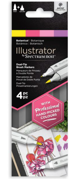
Botanical
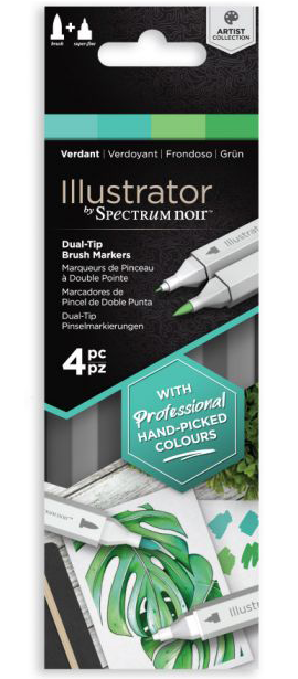
Verdant
Fiery
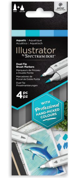
Aquatic
Delicate
Natural
Vintage
Stylish
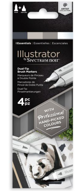
Basics
Essentials
Concept phase
This collection of sets had to satisfy the client’s goals as well as appeal to the target audience. No matter how well the product fits the brief, it’s a failure unless customers are eager to buy it. So I aimed at finding the perfect blend of client’s requirements and buyer’s desires.
I started by asking myself a series of questions.
Who is the target audience of this product?
How can this product be appealing to the buyer?
How can this product be as satisfying as possible to the buyer?
How to represent each theme?
What makes a balanced marker set?
Then one by one, I researched these issues to find answers and create a solid foundation for this project.
Who is the target audience of this product?
Artists who have some experience with markers, no matter how limited, as well as creatives who already own other Spectrum Noir products, like Classique markers. The second group can comfortably use bullet and chisel nibs but isn't that accustomed to Illustrator's marker brush.
Spectrum Noir's audience is predominantly female, though not exclusively. The age varies considerably, so the sets should be attractive for both younger and mature audiences. It means that packaging imagery can't be narrowly tailored to one group's interests but should be appealing to a broader audience.
That's where the first challenge came from:
create sets useful for artists with different skill levels
Another challenge was
choose on-pack illustrations appealing to a broader audience versus only to a small group
How can this product be appealing to the buyer?

Vintage set colour swatches
The goal was to inspire buyers. Instead of being confused and intimidated by the colour selection as it often happens with sets, creatives should feel comfortable. One way to achieve it is to clarify how these hues can be used together and for what. Another critical component is familiarity, the same, only different. So colours should tap into something already known with enough difference to excite.
Familiarity with a twist required meeting expectations without copying any existing offering. So the colour story had to be unique but nothing too exotic and unusual that could put a buyer off.
Besides, the colours had to look lush and eye-catching without making someone think about children’s pens. There had to be a professional look with some level of sophistication.
It all led to another challenge:
find a unique colour story rooted in something familiar for each set
How can this product be as satisfying as possible to the buyer?

Basics set final product together with the illustration
As consumers, we get the highest level of satisfaction when our expectations are exceeded. So a buyer should get much more out of the set than they expect.
The expectation was to get 4 colours. One way to exceed that was to create a range of new hues from the original 4. The more colours the buyer can make, the higher is the level of satisfaction.
It led me to the next challenge:
select such 4 colours that create a harmonious palette and a range of new hues when mixed
Another way to satisfy a creative is to provide a visually appealing product. Everything from the colour selection to the pack-front illustration and all the components inside should be eye-catching. So the challenge arose to
create a visually appealing colour palette and imagery
How to represent each theme?

Fiery set illustration
Each set was meant to cover one theme: Botanical for flowers and Aquatic for everything related to water. The list of themes was provided by the client at the beginning of the project.
I looked at common associations with each theme, for example, Fiery: fire, candle, sunset. The thing I wanted to avoid was to create a set that could only be used for one specific artwork. I wanted to give consumers an opportunity to bring different ideas to life, despite a minimal number of colours.
The challenge here was to
create versatile sets despite only 4 colours
What makes a balanced marker set?

Botanical set colour mixing diagram
To work well, a marker set should fit the following criteria:
Creative doesn’t have to buy any extra markers to make a beautiful artwork, only the ones included inside the pack.
3 tones are present for highlights, mid-tones, and shadows.
Warm and cool colours
It resulted in a challenge:
provide a tonal range within 4 markers of different colours
Another challenge arose:
create a mix of warm and cool colours whenever the theme allowed
Challenges that arose from the goals and research:
Create sets useful for artists with different skill levels
Choose on-pack illustrations appealing to a broader audience versus only to a small group
Find a unique colour story rooted in something familiar for each set
Select such 4 colours that create a harmonious palette and a range of new hues when mixed
Create a visually appealing colour palette and imagery
Create versatile sets despite only 4 colours
Provide a tonal range within 4 markers of different colours
Create a mix of warm and cool colours whenever the theme allowed
Colour choice phase
After learning more about the target audience, its preferences and needs, and understanding what challenges came out of that, I focused on finding a solution to fit all the criteria.
Step 1:
Select colours for each set

Verdant set colour swatches

All colour swatches
Criteria:
Include 4 colours
Provide tonal range
When mixed can create several additional colours
Look versatile, but harmonious together
No repetitions
Include warm and cool colours
I started working on a Botanical set first. Then one by one, I found promising colour palettes for each theme.
I focused on bringing out the individual nature of each set. For example, both Stylish and Essential focus on grey colours, but still they are unique as the first carries cool tones while the latter warm ones. So if an artist buys both of them, it won't be a repetition but a useful extension of their collection.
The combination of warm and cool colours allows to create harmonious artworks, emphasize light and shadow, and bring visual diversity. The latter was crucial for Verdant and Aquatic, but also played a significant role in Delicate and Vintage. When you look at Verdant, it's all green, but there is a variety thanks to a mix of 2 warm and 2 cool colours. It makes this selection lively, instead of dull. It was a bit trickier with the Aquatic set. Here colour bias played a key role: I went with 2 blues biased towards green and 2 with a slightest purple undertone. Together they produce a variety of hues and possibilities.
For Vintage, the addition of warm beige FS7 made the whole colour story click. The same is true for Stylish. Bright warm red DR3 makes an otherwise cool palette balanced and gives it a sophisticated quality.
Because of these sets' limited nature, most of them contain markers of 2 tones: light and medium. Darker tones are created by either layering the same colour multiple times or mixing the hues. Marker ink is semi-transparent, that's why with every layer, it becomes a bit darker. By using both approaches at once, the deepest colours can be created. This goes back to the goals:
encourage experimentation + colours create new hues when mixed
Only a couple of sets: Fiery, Stylish, and Essentials, have 3 tones right out the box. Their palettes are the most tonally diverse.
Step 2:
Make collection work as a whole

5 marker sets stacked

5 marker sets stacked
This step was necessary to support the goal to
create one harmonious palette, so sets can be purchased separately or as a collection.
I laid the colours out on one huge piece of paper to keep the whole selection in front of me. The hues couldn't repeat and had to work well as one 40 marker story. For example, both Delicate and Vintage have peachy pink hues. However, they are unique in each set. At the same time FS3, FS6 from the Delicate set, and FS7 from the Vintage one belong to the same colour family, which makes them mix effortlessly.
Other kits also have markers from the same families such as:
CR2 in Delicate and CR5 and CR9 in Fiery
PV3 in Botanical and PV4 in Basics;
TB2 and TB4 in Aquatic and TB3 in Basics
BO1 in Fiery and BO4 in Natural
CT4 in Botanical and CT3 in Basics
DR3 in Stylish and DR2 in Basics
Such intersections help the collection work as a whole.
Basics has the largest number of ties to other sets, which is not a coincidence. It had to serve as a basis that you can build upon.
In many cases, it was possible to use another hue without much of a difference for the individual theme. However, it would've affected the colour story as a whole, so I adjusted the colours to make a coherent palette.
Overall, colour choice was guided by the goal to
create one harmonious palette
Artwork creation phase

Colour usage diagram in Verdant set illustration

Natural set illustration
After colours were selected and approved by Spectrum Noir, I focused on finding the best examples to represent those sets.
The criteria here were to create such artworks that:
Use all 4 markers in one illustration
Rely on colour mixing and layering
Show tonal range
Appeal to a large audience
Include familiar visuals
Inspire
Push against the limitations
Focus on brush techniques
Based on the brief, package illustrations were meant to inspire.
To motivate others to create, the images had to be appealing and challenging, the result a buyer would thrive to achieve.
One by one I chose suitable references for the on-pack illustrations. I focused on motifs that artists enjoy and create often but added my own spin to them. For instance, dolphin is a common and widely beloved aquatic animal. That’s why I chose it to represent the aqua theme. By adding rays of sunlight underwater, I made this image stand out from the similar ones.
To push the boundaries, I worked on creating as many hues as possible with only 4 markers by mixing and layering them. I focused on achieving tonal depth in every artwork by creating deep shadows using layering. In case of the Delicate set, I also challenged what people envision such marker sets to be by adding a rose to the female portrait.
Besides, I strived to show the full potential of brush techniques in every illustration. The most prominent examples are Natural and Aquatic. Because of a brush nib, I could show the diversity of fur by using strokes of varying width and make waves look fluid and lively. In other illustrations, the brush helped me to achieve a smooth transition of colours, letting inks flow into each other. The fine nib allowed me to add tiny details and textures. It ties back to the goal to
prompt regulars to extend their marker collections with new sets.
As brush and fine nib allow a number of techniques that cannot be achieved with other marker tips like the ones Classique pens have.
Diagrams creation phase

Basics set colour combinations diagram
During the final stage of this project, I worked on creating diagrams to show how to mix colours. The visual representation of colour mixing makes it easy to follow and gives artists an idea of what they’ll get if they combine 2 or more colours.
The aim was to make the visual representation comprehensive and straightforward. I looked at different ways to show how colours can be combined. After trial and error, I settled on a Venn diagram. I adjusted it to fit each of the sets. These diagrams don’t represent all possible hues but rather give a starting point for creatives to work with.
Outcome

5 finished sets
Over the course of 1,5 months, I went through the whole marker sets creation process with the client.
We went from the idea of a new product range to prototypes ready to be produced. I relied on the client's knowledge and understanding of their target audience while they trusted my expertise as a marker artist and colour expert. Together, we created a well-received marker collection currently sold in 34 countries, both online and in stores.
As anticipated, some creatives choose to buy the whole range of 10 sets, while others pick the ones that align with their preferences and extend their personal marker collections.

Delicate set final product together with the illustration

Delicate set illustration
10 Kits. Full Range


Client’s Testimonial


We have had the pleasure of working with Tatiana on a number of projects. In addition to the excellent artistic quality of her work, she is highly organised, efficient and always has a detailed appreciation of our commercial goals. This not only delivers the first-class creative result we need, but also enables the entire process to run painlessly smoothly and on time in line with our objectives. I would not hesitate to recommend Tatiana for any creative project.
– Simon Hodges. Head of Art at Spectrum Noir

Hire Me
Do you want to turn your idea into a tangible product? Use colour to your advantage. Hire me as COLOUR EXPERT. Together we can create products that will appeal to your audience and meet their needs.